Tucked inside the U.S. government's latest update to its official eating advice is this recommendation: "Drink water instead of sugary drinks" — aka soda.
The bluntness of this statement is remarkable, in part, because the Dietary Guidelines released Thursday are, in other ways, anything but direct. For instance, as we've reported, instead of explicitly telling Americans to cut their intake of red and processed meats, as an advisory panel of nutrition experts had recommended, the final guidelines hint at meat reduction in subtle terms. That change in messaging may have been linked to pressure from the meat industry.
By contrast, the government's language on choosing water over sugary drinks is as clear as a glass of H2O. It is not, however, all that easy to find. We spotted it inside this MyPlate, My Wins tip sheet, part of a new campaign the U.S. Department of Agriculture also launched Thursday.
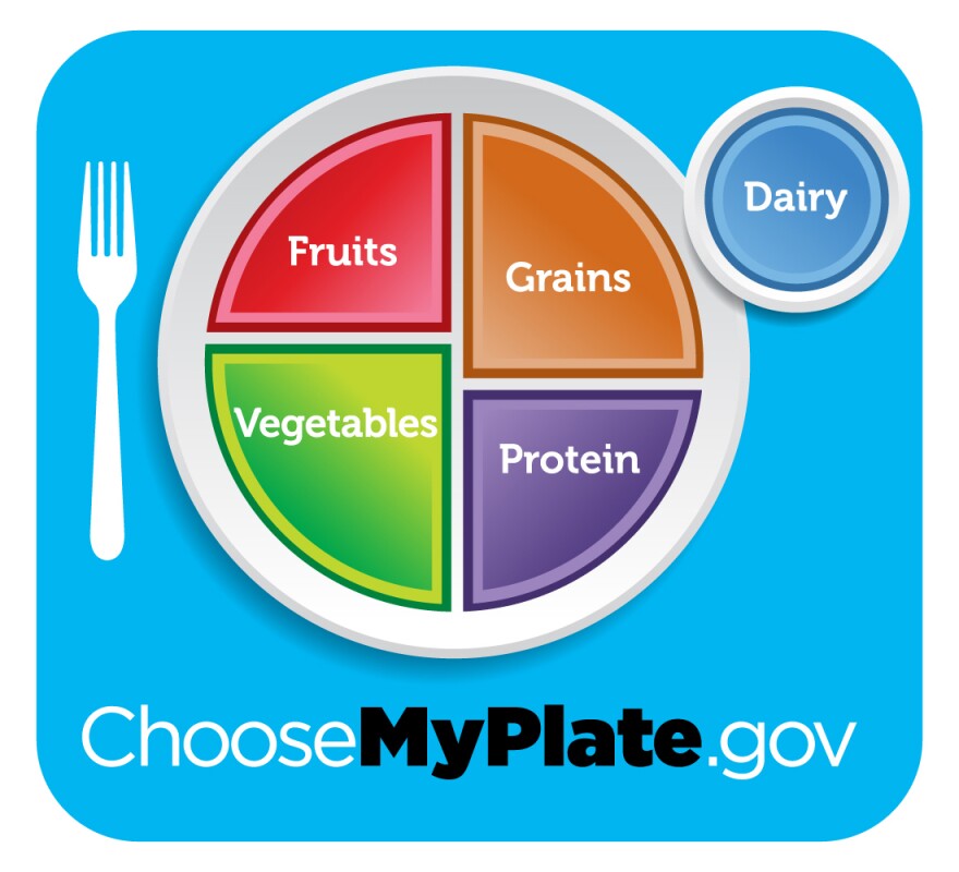
MyPlate, if you recall, is the icon of a dinner plate divided into portions of fruits and vegetables, grains and proteins that replaced the food pyramid in 2011. Unlike the Dietary Guidelines, which are written for nutrition professionals, policymakers and the food industry, MyPlate is for the general public. It's an image that ends up in nutrition education materials in doctor's offices, textbooks, school cafeterias and lots of other places.
Last year, as we reported, a coalition of nutrition scientists and public health advocates called on the government to add water to the ubiquitous MyPlate icon. Numerous studies have linked sugary drinks like soda to obesity, Type 2 diabetes and heart disease. Adding some sort of water symbol to the MyPlate icon would really bring home the message that water, not soda, should be the beverage of choice, advocates argued.
That didn't happen, and, in fact, the USDA says it has no plans to alter the MyPlate icon, which the agency says will remain the visual centerpiece of its healthy eating messaging.
Instead, we got the infographic above — what the USDA says is the first of several new tip sheets to be released.
As you can see, the message to drink water, not sugary drinks, shows up there — in the very bottom, right-hand corner. While the language is clear, the visuals around it are hardly compelling.

"Ideally, [the water symbol] would be part of the main MyPlate image. That's the thing that's going to get the most publicity," says Michael Jacobson, executive director for the Center for Science in The Public Interest, who was among those who signed the letter calling for stronger language on water in the Dietary Guidelines.
It's also worth noting that, while 100 percent fruit juices also pack a sugary wallop, the MyPlate, MyWins tip sheet lists them as an acceptable form of getting your daily fruit intake. (The actual guidelines add more nuance, advising that people get at least half their recommended fruit intake from whole fruits.) For the record, William Dermody of the tells us that "moderation of beverages is something we're in line with as well."
Overall, the new tip sheet's messaging is confusing, says New York University nutrition professor Marion Nestle, a noted critic of the influence industry exerts on government food policy. "It's ugly and it's hard to read," she tells us.
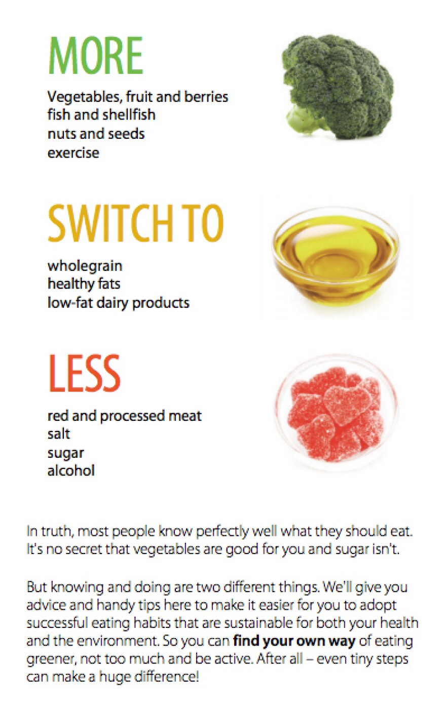
In general, she wishes the government's visual messaging on what Americans should and shouldn't eat was much more explicit. Nestle points to guidelines from Brazil and Sweden (see below), which — as Julia Belluz has pointed out over at Vox — are breathtakingly easy to understand. Their virtue? Instead of talking about nutrients, they focus on what people really put in their mouths. "They're about real food," Nestle says.
Copyright 2020 NPR. To see more, visit https://www.npr.org. 9(MDAxMzY2MjQ0MDEyMzcyMDQ5MzBhZWU5NA001))


